
The Project
Refresh the ZGA brand positioning it for growth in both local and international markets.
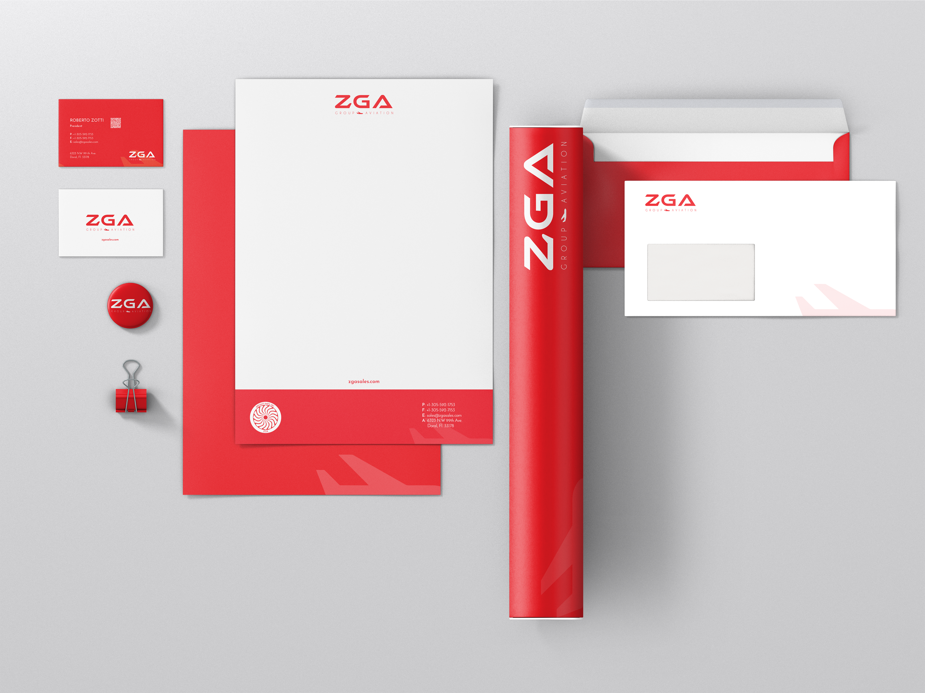
The Brand
Focusing on the aircraft parts and their different symbols, we decided that a combination of aviation figures would best represent ZGA. An eye-catching, easily recognizable logo mark that represents safety, stability, and strength. The sleek typography gives the logo a modern air, emphasizing the focus on innovation, technology, and new trends.

The logo comprises two distinct yet integrated parts: the signature logotype and the tagline.
The typography conveys a sense of movement, echoing the experience of flight. Subtle aviation cues are woven throughout the design.
Most notably, the "Z" cleverly incorporates the silhouette of an airplane's tail, while the "A" evokes the delta symbol, a classic representation of aviation and forward progress.